Now with our idea we looked into terminator which has the burning playground scene which had an influence on our final outcome so i wanted to look into it now. Now the scene shows all the children but since we were only doing 2 characters we just used the the symbolism of the playground and used the fire like this scene did to show that bad things have happened to the area. While the fire is more wide spread in this we like the idea of less is more and just put it on apparatus in the playground that shows a more sinister design rather than just random flames dotted around the level. We decided instead of changing the textures on the objects we would use the darkness of the level to trick the viewer.
In the end this one scene had a major influence on how the final layout appeared.
Thursday, 6 December 2012
Cut scene or Cinema
Now with our piece being more cinema I decided to look more into more movie like cutscenes rather than conventional cutscenes such one is the one below for mass effect 3 and while it does have some good cinematic shots. It has a very monster movie like feel to it and what i count as a cinematic cutscene is a cutscene were you can put the controller down and just enjoy it which i think this is.
Now while alot of games are going for cinematic cutscenes some just don't get me putting my controller down, but one does and that is Halo 4 with it's sci fi movie style shots and atmosphere which while not the genre we are doing i want to have that effect on people watching our cinematic. I think that with how eerie we made it we have pulled that off well but there are a few here i think we should of implemented if it was longer than a minute but since it wasn't i think what we choose was right.
Now the halo one below is not a main story cutscene so i don't spoil it for people but this is a stronger applicant to my point that i made especially since it uses a lot more shots that would work for our scene.
The Human intereaction is the style that we will want except not with looks or actions but other factors such as music and the atmosphere around us which is alot more like mass effect.
Altogether my main point is that there are alot of movie cutscenes around but if played well like these are it can cause more immersion for the player which is an angle i hope we can replicate.
Finished Turntable
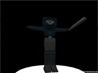
Here is the finished body in a turntable in unity i must the turntable is a new process which i enjoyed learning since it gives the character a professional feel. The use of light lets me see the character in the way i envisioned him even if still in the T pose due to being able to set up the mood which i think i did a good job with.
The Bottom two are animated and i have done screenshots in poses that i like. I think besides the sketchy animation this turned out really well and i would happily show my work off to people which includes people who aren't friends and biased.
Time to move it BOY!!
Now the bit i hated for my own ignorance the animating. The animating i admit it isn't to bad but were my ignorance lies is with the graph editor and my lack of skill with it and how to make it walk normally which annoys me since i did biology a level and physical education in GCSEs. Rant over i found what really screwed up the animation is the bands around the legs which caused the faces to collide during movement which made the legs move erratically which was as i said earlier was the problem which i couldn't rectify. Besides all that trouble i was quite happy with my jittery character but i would go back and change the animated walking speed to be a little slower.
It's Alive
Now rigging i had no problem with when designing the rig thanks to matt's vid but it did lead to an awkward part later that by the time i noticed the leg was to far forward in idle mode it was too late to correct so i had to go back to a earlier save before binding. and correct it. Also the controls were no problem since i found that part easy. but on to skinning i just mentioned i had abit of trouble but i corrected it quite easy due to the early stage of the problem. The skinning became a little differcult due to the bands around his legs due to how many faces were present and how much space between them which caused the movement to be jumpy so next time i'm getting rid of them or making them flat.
Birth of the Thug
Now on to the modelling i had abit of trouble with this since i had to design it 4 times since the first file was corrupt, the second file had a problem with the design as did the third, and the 4th is the one you see above. Even though i had created the half of the model when i mirrored the geometry it still had problems i realised too late that it was one extra face that caused the problems.
Happily i had no problems with uv mapping it and texturing it since i did the mask and the baseball bat separately to the main geometry which made it alot easier that trying to do it all at the same time. I did have a bit of trouble when it came to the bands around the legs from mirroring as well as texturing.
When i finished it thought he was very blocky it really suited the comparison to the kid. Next time i do this guy i am not doing the leg bands or will instead just make it a colour on the leg instead.
To be the thug or not the thug
Now this is the character sheet for thug/the skull which at the moment has only influenced the design of the character not much else. i know this will influence the animations when i get round to it but due to all i'm doing is modelling it is a bit unneeded. i would of like to put more into this but due to the small amount of time you see him for it was hard to decide on a personality so i think to improve on this i will need to in the future design of characters make a story past and before the project so i can create immersive characters.
Turnaround bright eyes
So this was the turnaround which was used for the modelling image plane which had more of the style that the character was going to look like. The character looks quite blocky in this pic but as i was drawing the character turnaround i noticed that the scale of the head makes the head the same size as the shoulders which by measurements is just the right scale. The reason i only gave the character one arm in the T pose is due to me only modelling the one side and then mirror the geometry across which formed the overall character plus even as a T pose the character is showing attitude.
Evaluation: I had a bit of trouble thanks to this drawing due to him being at a bit of a slant which caused the lining up in maya, to be more awkward than it needed to be especially when scaling the two sides so the character could be created oh well need to use a grid next time or a ruler.
Evaluation: I had a bit of trouble thanks to this drawing due to him being at a bit of a slant which caused the lining up in maya, to be more awkward than it needed to be especially when scaling the two sides so the character could be created oh well need to use a grid next time or a ruler.
Final Concept
So here is the man that would storm though our scene, the design of this man took reference from two movies i had watched recently which were The Warriors which is a gang based theme from the 80's and aDeath Wish 3. Death Wish 3 has a gang ruling a neighbourhood and a lone detective comes to help the citizens against them. The use of colour here is a very natural shade which works well with the trees giving him a very nature oriented appearance so in the village/forest he looks like he fits the location. the style is a bit more normal like you would expect someone to walk down the street looking like this minus the mask of course which gives him a more captivating appearance when he is linked to the style of the kid that tom is creating.
Evaluation: This is definitely the style i want for the character and when it comes to modelling it doesn't have as harder design compared the others. Unlike the picture above the original had a more human scale and the baseball bat had a normal design but due to the style of the kid and to keep the style of the universe in general i increased the size of the bat, his head and his feet which made it so they could stand in the same place and not feel so weird in the long run.
So with this decision my next job should be the start of the modelling so lets get to it.
Concept 3
Okay now these were my first ideas for the character back when he was going to be less human but that evolved into instead of inhuman faces to the use of masks, as i drew some ideas i came up with the bottom pic right side pic which was the mexican skull mask. The mexi mask worked well because instead of hiding his face completely or showing it the design gives you the basic shape of his face and looks but with the ability to not show emotion. Masks have been used due to has a inhuman quality such as how roman cavalry used the emperor's face as masks since it gives a human look but shows no fear no emotion and no remorse which suits what this character would do in the cinematic.
Evaluation: now the mask concept really helped build up to what the character would look in the end but that isn't all. The hooded figure at the top right really helped since the use of more common clothes helped create the character as we wanted since a hoodie has it's own connotations that we could use effectively to make this character more menacing to the child and viewer.
Concept 2
The idea of this guy came from a combination of mass effect styled clothes and mr fries (DC Mr Freeze) and while i like the style of long jacket i think the colours are to vibrant when looking back at it and the style of the colours seem to unnatural when comparing to the environment. the bottom right is a style that i like for this character design since it feels more mafia and yakuza, but that is the problem it looks too fantasy organised crime while the design for the character we wanted was more street gangs or small criminal group. We also wanted a hood but the hood look didn't work for this guy so that was another strike against him in the long run but i did take some influence for when i designed the final concept.
Evaluation: Nope.....due to the style it didn't work for us even if he was easier to model than the last one so this boy will only stay a concept.
Concept 1
I am going to write a section on each of my concept designs and give the pros & cons of them.
Now while i got influence for this from arkham city as well as final fantasy this idea was one i really liked but what knocked this guy down was the muscular arms which caused you to pay attention to them first, and the difficulty for the modelling would be high for just starting with the rigging and such.
On the right there are some variations of masks that i could possibly use on this person, looking into the style of the environment it doesn't have enough contrast to the fire used and due to the darkness of the level it would be to similar to the character.
Evaluation though it is a good design it is a no go unfortunately maybe another time.
Initial idea development
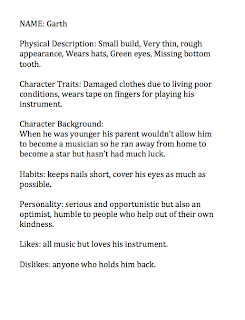
While we were looking into an initial idea i came up with one and so did tom now since he designed one he can tell you about his and i will talk about mine. Above are the character sheets for my alien characters but the setting for the scene is a bar in a more shady area and it goes along the line of a downtrodden musician and a helpful barman. The story progressed that while the musician is drinking the barman comes over to give him a letter with a venue on it and the musician leaves while thankful to the barman.
We ended up getting the class to decide between our two ideas and the one that was chosen was tom's idea so we went with that idea but as a personal project i will one day do my design on my own. As we were looking at the two designs we did moodboards for multiple aspects of the design ranging from hoods to surveillance and they are all in the hand in folder.
Wednesday, 5 December 2012
Final alien
Once i Binded the skin i went to weight painting which is weird to say the least it was interesting but took a long time to do and i needed to do it about 5 times just to get the movements right but still ended a little weird with the movements.
But as you can see from the bottom picture the rig turned out well and after smoothing i think the alien looks brilliant but not to sure about the movements when animating it for the turntable.
I will definitely use this rig to practise my animation in the future since it works quite well except the left hand moving weirdly when the right arm moves.
Alien Control
Like i mentioned earlier these are my screenshots of controls for my rig this was another calm and enjoyable bit for me due to the simplicity of designing the shapes and parenting to make the controls work.
Now unlike the other posts this is a really short post due to the actually process length to do the controls and how easy it was due to matt's video about it online.
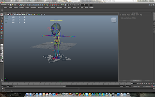
After doing a few modifications all i needed to do was skin the rig which i will talk about in the next post.
Alien has a skeleton
This is the textured model that has smooth preview Which i think looks really good. With that done it is time to enter new territory which is rigging, controls and skinning. I really enjoyed learning the new parts of maya which is handy because i needed to know them for the character we needed to design later.
These next two pictures show the Rig in all it's glory, now this was interesting for multiple reasons one being that is something new and as a gamer it is fascinating since this is what game companies do which makes me feel like i am working towards that goal in the future. After that though it got a bit annoying since my right knee was were it was supposed to be so i had to redo the knee which took extra time and patience.
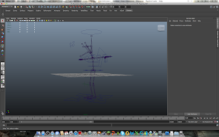 I wish i could of tried this with my original geometry but maybe in the future i will come back to my original geometry and try and fix it to be able to be used for rigging.
Alien Exercise UV Mapping
Like i mentioned in the last part my geometry went wrong when it came to this part. While we tried to work out what went wrong it came to a point so i don't terribly fall behind Matt gave me his basic geometry so don't be surprised that from now on the character looks different.
 |
| Failed one |
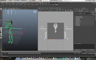 Now i have taken each section of the geometry apart for UV mapping and i have to admit this is the part i don't mind since it is quite relaxing if you know the geometry, i had to look over it a few times since it wasn't mine so it took awhile to familiarise myself with it.
The Bottom picture shows my Geometry mapped out for texturing, with my texture i tried going for a martian manhunter (DC) influence which sort of worked i will show the picture in the next post.
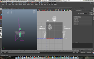 Because my geometry screwed up i was a bit annoyed at this point so the calm part of uv mapping, texturing and matt's help really helped me from going crazy over the week we were doing this other wise i think i would of snapped.
Alien exercise
I decided instead of putting my ideas for our own creative section of this brief first i will put the exercise we did with matt to learn the techniques down first so here we go.
So the first part is modelling the alien and the design we used was drawn by Matt so we all had a similar design. After importing the image planes in we got to work, i started modelling from the head down on this model and tried to keep with the image planes design. Doing this reminds me of the modelling of last year so it was fun to get back into it at first but after awhile you always have that face that won't go the way you want it too.
I extruded from the base of the head to make the neck and the rest of the body. I had a hard time with the knees and the arms due to making it easier for the rig later. When i finally got it finished i had a little trouble mirroring the geometry due to a few UVs but when it was done i liked how it looked.
Now unfortunately this was all a hollow victory when i got to the UV mapping but i will tell you about that next time.
Subscribe to:
Comments (Atom)


